置換要素(img)と ブロックレベル(p)の比較
<img>要素と <p>要素の width:auto と width:100% の表示を比較してみよう。
どの要素も padding と border を指定しています。
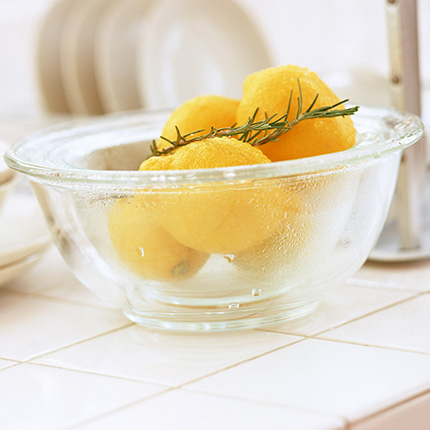
元画像
プレビューはこちら↓
ほんっとにはじめてのHTML5とCSS3【16-1】幅の width、高さの heightプロパティ
<img>要素と <p>要素の width:auto と width:100% の表示を比較してみよう。
どの要素も padding と border を指定しています。
元画像
プレビューはこちら↓
width:auto
padding:0; height:30px(width は無指定でデフォの auto なので、アスペクト比が保たれます)
width:100%
これは p要素です。
padding や border は含まずに親要素の100%になるので、はみ出します。
width:auto
これは p要素です。
padding や border を含んだ状態で親要素の幅に合わせるので、はみ出しません。
padding:0; height:30px
これは p要素です。
幅は無指定なので、デフォルトの width:auto です。
ブロックレベルの要素だと、高さがコンテンツより小さいと、中身があふれます。
このページのHTML。
<section id="smp">
  <img src="smp.jpg">
  <img src="smp.jpg">
  <img src="smp.jpg">
  <p>〜テキスト略〜</p>
  <p>〜テキスト略〜</p>
  <p>〜テキスト略〜</p>
</section>
サンプル部分のCSS。
section#smp {padding:1em 0}
section#smp img, section#smp p {
	display:block;
	margin:0.2em 0 3em;
	border:solid 30px #F99;
	padding:50px}
	/*heightは指定していないので 全部「height:auto」です*/
section#smp p {background:#ffc}
section#smp img:nth-child(1) {width:100%}
section#smp img:nth-child(2) {width:auto}
section#smp img:nth-child(3) {padding:0; height:30px}/*widthは指定していないので「width:auto」です*/
section#smp p:nth-child(4) {width:100%}
section#smp p:nth-child(5) {width:auto}
section#smp p:nth-child(6) {padding:0; height:30px}/*widthは指定していないので「width:auto」です*/